Style
Coupdoeil does not need to import CSS to display popovers. However, the gem proposes built-in animation and arrow style. To load all CSS, add import to layout file:
<!DOCTYPE html>
<html>
  <head>
    <!-- ... -->
    <%= stylesheet_link_tag "coupdoeil/popover" %>
  </head>

  <body>
    <%= yield %>
  </body>
</html>
You can also load only one of the stylesheets:
    <%= stylesheet_link_tag "coupdoeil/popover-animation" %>
    <!-- or -->
    <%= stylesheet_link_tag "coupdoeil/popover-arrow" %>
Animation
See animation option page for available animations.
Animation uses el-transition library, and so you need an implementation of the .hidden class such as:
.hidden {
    display: none;
}
Arrow
To display an arrow on the side of a popover, you can add a <div data-popover-arrow></div> element within the layout:
<%# app/views/layouts/popover.html.erb %>
<div class="shadow rounded p-2 bg-white border">
  <div data-popover-arrow></div>
  <%= yield %>
</div>
With default style, the arrow will be rendered appropriately so it points to the middle of the target on which the popover is attached.
See arrow option page for solutions to hide arrow on a per-action basis.
Arrow style is based on CSS variables you can edit so the arrow fits your style:
.coupdoeil--popover [data-popover-arrow] {
    /* The background color of the arrow, defaults to the default layout background color */
    --co-popover--color: white;

    /*
        Border variables should match the border style of the popover element,
        defaults here match the default layout style.
        Note that depending on browser and screen resolution,
        setting border size to 0 won't completely hide its border,
        it is recommended to also set border-color to transparent
    */
    --co-popover-border-size: 1px;
    --co-popover--border-color: rgb(209 213 219);
    --co-popover-border-style: solid; /* */

    /*
        By default, arrow is as tall as it is wide,
        it is recommended to only change height and ratio and let width
        be computed out of this values
    */
    --co-popover--height: 0.75rem;
    --co-popover--size-ratio: 1;
    --co-popover--width: calc(var(--arrow-height) / var(--arrow-size-ratio));
}
For example, you can change the size of the arrow by changing the according CSS variable on inline style of the arrow element:
<div class="coupdoeil--popover" data-placement="top"> <!-- the popover positioned wrapper -->
    <div data-popover-arrow style="--co-popover--height: 0.5rem;"></div>
    <div> <!-- the popover layout -->
        <div></div> <!-- the popover content -->
    </div>
</div>
It is recommended to change its size by changing its height only, and its shape by change its size-ratio, since width is calculated from these two variables.
You can also implement your own arrow style by relying on the position set on the popover element.
<div class="coupdoeil--popover" data-placement="top"> <!-- the popover positioned wrapper -->
    <div data-popover-arrow></div>
    <div> <!-- the popover layout -->
        <div></div> <!-- the popover content -->
    </div>
</div>
Styling wrapped element when popover is open
If you want to change the style of an element within a <coup-doeil> tag when the popover is open, you can use an attribute selector since data-popover-open is set to true. eg:
coup-doeil[data-popover-open] a {
    color: blue;
}
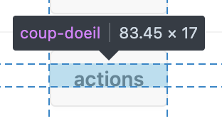
Wrapping coup-doeil around buttons and other inline elements
The default browser display style of the <coup-doeil> element is display: inline;. That means it will wrap around other inline element by ignoring their padding.
<coup-doeil>
    <button type="button" style="padding: 12px">Click me</button>
</coup-doeil>
This HTML without any other style will by default make the <coup-doeil> wraps around the “Click me” text, not the button box.
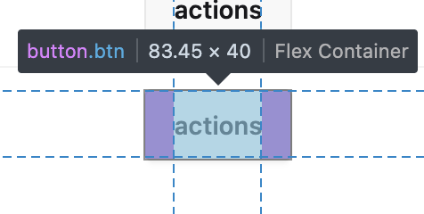
To prevent this, you can set the display property of the coup-doeil to inline-block.
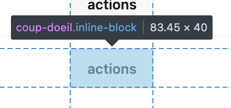
There is no counter-argument to set display: inline-block; as the default style for the <coup-doeil> element.