 Coupdoeil (1.2.1)
A framework to easily create popovers.
What is a Coupdoeil::Popover?
Popovers are ruby objects used to easily build powerful popups (from basic tooltips to full dialog popovers). They are mostly inspired by GitHub popovers (like hovering on a link to a repo, or a username) and Wikipedia popups (when hovering a link to another wikipedia article).
Click to toggle examples
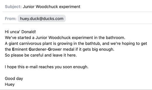
A quick look on a contact details
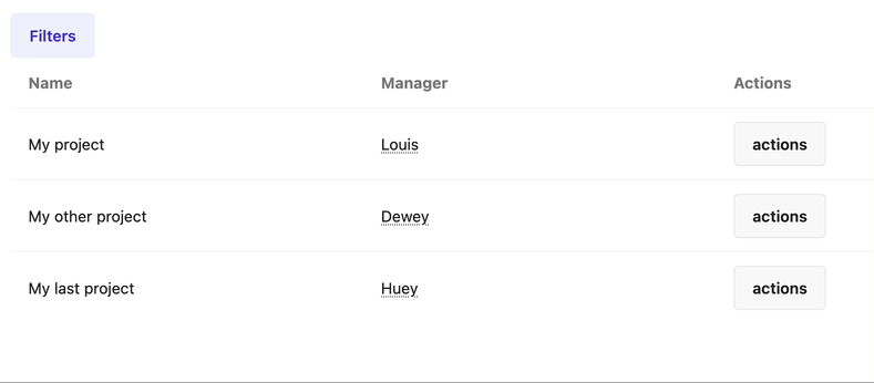
A filter form in a popup
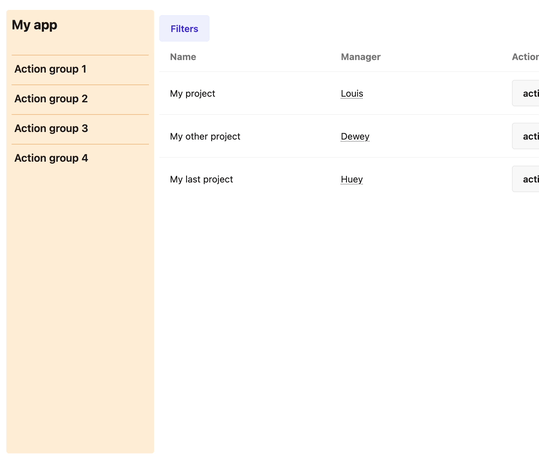
A side menu with sub items
The current implementation takes inspiration from both ViewComponent and ActionMailer, to make it as easy as possible to use while offering a wide range of possibilities.
# app/popovers/contact_popover.rb
class ContactPopover < Coupdoeil::Popover
  def details
    @contact = params[:contact]
  end
end
<%# app/popovers/contact_popover/details.html.erb %>
<div class="contact-details">
  <%= image_tag @contact.avatar %>
  <strong><%= @contact.first_name %> <%= @contact.last_name %></strong>
  <!-- ... -->
</div>
Which is embedded by doing so:
<%# app/views/messages/show.html.erb %>
<div>
    <span>From: </span>
    <%= coupdoeil_popover_tag ContactPopover.with(contact: @contact).details do %>
      <span class="contact-pill"><%= @contact.email %></span>
    <% end %>
</div>
An alternative syntax using a dataset also exists. See dataset syntax documentation.
Why use Coupdoeil popovers?
The concept of ‘quick look’ allowed by popovers can really improve UX by avoiding the need to navigate to another page and back again just to check summary for a resource. It also permits to hiding until use some parts of UI like small forms, or quick actions in a list of elements.
The most common examples of such popover are on GitHub (when hovering over a link to a repo, user profile, a PR, etc.) or on Wikipedia (when hovering over a link to another article).
While basic popups implementations can be made with simple helpers, data-attributes, and a bit of JavaScript, it tends to get too complex over time and often not handle enough edge-cases to be used everywhere it could improve UX.
Coupdoeil::Popover offers a way to easily encapsulate and power up popovers rendering logic. It allows a lot of customization possibilities (see options) and promotes re-usability by using an API similar to parameterized ActionMailer (see Why does it look like a mailer?).
This gem also tries to handle all known issues of such popovers, such as the user’s mouse quickly leaving and re-entering popover without closing it, preventing opening of a popover if mouse did not stop on it, etc.
Performances
By default, a popover content is not loaded until it is needed. It means the DOM is not cluttered with ‘maybe to be used’ HTML, hidden in template tags or data-attributes. However, params have to be present in HTML so they are sent for rendering the popover (eg: a record id), so try passing as few as required to build it later during render. Also, popovers are cached so the fetch happens only the first time a popover is open.
When needed, popovers can still be preloaded and included in DOM on initial page load. See preload option.
Architectural decisions
If this overview raises some questions about some specifications of the library or its name, you may find some answers here: Architectural decisions. In practice, the word coupdoeil is only used in the helper, if you feel it might be too cumbersome to write every time you use it you can create an alias.